| Project Name: | Sephora Robson Street |
|---|---|
| Project Location: | Vancouver, British Columbia, Canada |
| Alucobond Materials: | Alucobond® PE naturAL Brushed |
| Architect: | Francl Architecture |
| Fabricator: | Keith Panel Systems Co. Ltd. |
| General Contractor: | Marcon Construction Ltd., of Langley, British Columbia |
| Photography: | Daniel Lunghi Photography |
Beauty authority Sephora is internationally recognized for its unique retail concept, which combines an extensive array of top-of-the-line beauty and cosmetic products, sales consultant expertise and distinctive store design. While all stores utilize Sephora’s bold black-and-white color scheme, each store features unique design elements with many incorporating Sephora’s iconic “S”-shaped flame logo in store décor and signage.
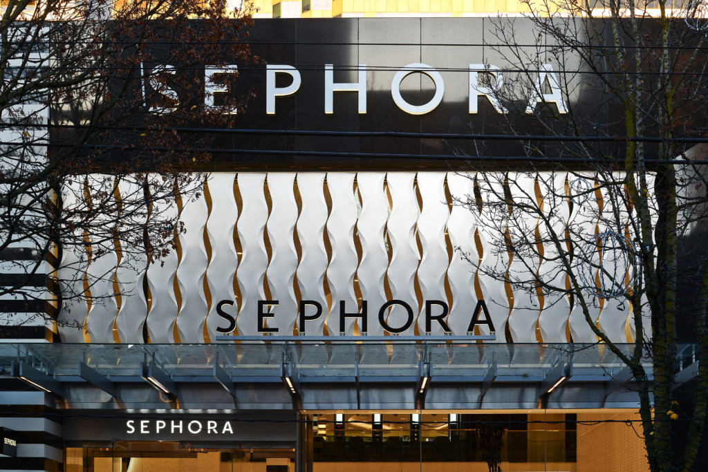
The new Sephora Robson Street retail store – which opened in late-October 2014 in downtown Vancouver, British Columbia, Canada – not only included Sephora’s logo as part of its storefront décor but took corporate branding to a new level in the form of a custom two-sided dimensional sunscreen that captures the “S”-shaped flame in its negative space.
This unique sculptural element – which was installed across the location’s 480-square-foot second-story glass storefront – was formed with 1,000 square feet of 4mm Alucobond® naturAL aluminum composite material (ACM) in the Brushed finish.
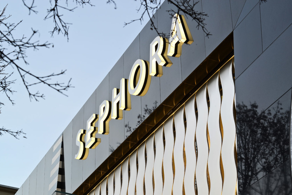
When Sephora announced that it would be opening a retail store in the trendy Robson Street shopping district, anticipation by local shopping aficionados could not have been higher. The new 9,900 square-foot retail location – featuring a 7,650 square-foot main level plus a 2,250 square-foot mezzanine – would be Sephora’s largest store in Canada.
French-based Sephora – which was founded in Paris in 1970 – operates approximately 1,900 stores in 29 countries worldwide, with an expanding base of more than 360 stores across North America. Sephora opened its first North American store in New York in 1998 and its first Canadian store in Toronto in 2004.
Francl Architecture, of Vancouver, British Columbia, was hired by building owner West Coast Projects Ltd., of Vancouver, British Columbia, to collaborate with Sephora corporate designers working under the direction of Jason Arth, LEED AP, ID+C, senior director of store design and based at Sephora’s North American headquarters in San Francisco.
Sephora provided early design elevations of a typical store as well as required store elements – including the installation of a black-and-white pole design on the storefront, according to Scott C. Mitchell, Architect AIBC B.Arch BFA, senior associate, Francl Architecture, whose team incorporated those specifications as well as requirements for a two-story store design by West Coast Projects Ltd. “The building owner wanted to create a very dramatic double-height space,” said Mitchell.
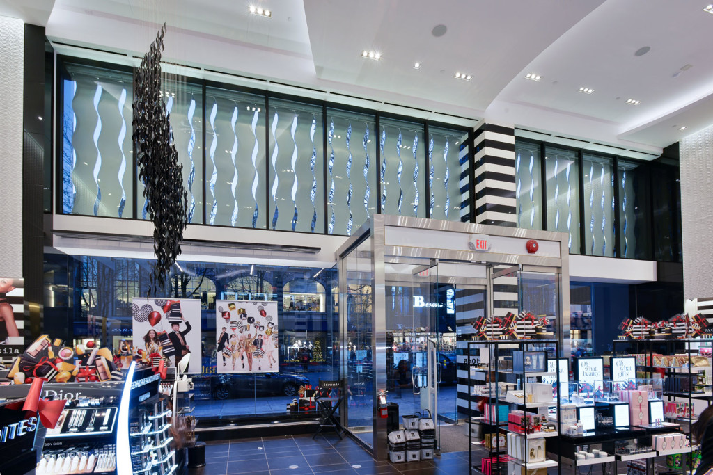
The second-story mezzanine would increase retail space and serve as home to the world’s first VIB Rouge studio – which provides beauty services to high-level Sephora rewards program members. The inclusion of the double-height storefront, however, would require that store cosmetics be protected from the sun’s rays entering the southern-facing location.
While Sephora’s architects originally thought to cover the second-story storefront with a massive TV screen, Francl Architecture was hesitant to present the idea to the City of Vancouver because it had been reluctant to approve this type of multi-media décor, according to Mitchell.
“We got behind the idea of a sculptural décor element,” said Mitchell. “Its purpose would be to allow light into the store in an interesting way while minimizing cosmetics’ exposure to solar radiation. … Our initial design concept for the storefront included a large illuminated Sephora ‘S’ in black granite. We decided to also try to incorporate the Sephora ‘S’ in the sculptural screen. When we presented the idea to Sephora, they were excited as well as concerned because it was quite a geometry exercise. If we adjusted the height by a foot or the width by an inch, it had major repercussions. ”
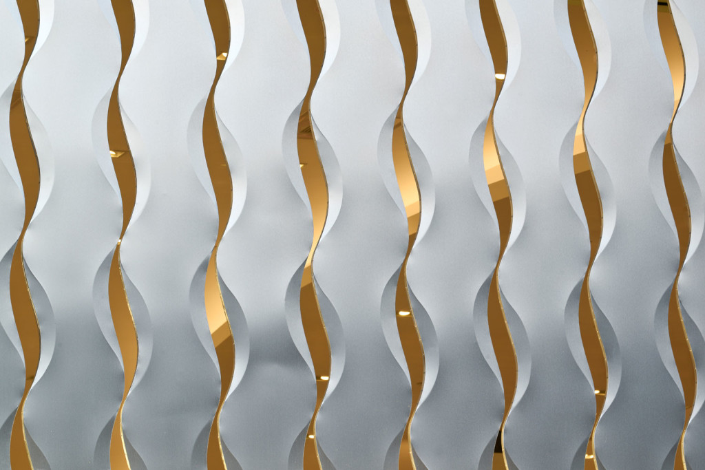
Keith Panel Systems Co. Ltd., of North Vancouver, British Columbia, began meeting with the architects in early 2013 to discuss design and engineering of the sculptural element. Marcon Construction Ltd., of Langley, British Columbia, served as general contractor for the project.
“This was a very unique project,” said Carlo Gatti, business development manager, Keith Panel Systems (KPS). “This sunshade screen installed over the storefront window had the true intention of serving as an artistic piece representative of Sephora’s corporate image with the negative space creating an ‘S’. … We suggested creating this decorative element with Alucobond because we’ve had good success in manipulating this product in unique ways.”
Alucobond naturAL in the Brushed finish was selected for the Sephora sculptural element for “the qualities it offers in reflecting ambient light conditions,” according to Gatti.
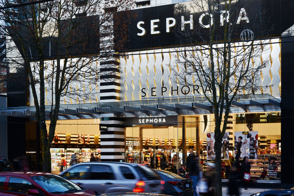
“We’ve used Alucobond a lot,” said Mitchell. “It’s a default product because it does everything well. We selected Alucobond in the light-silver brushed finish because it contrasted well with the black granite on the storefront. We also needed a product that would complement the stainless-steel canopy and street-level glazing mullions.”
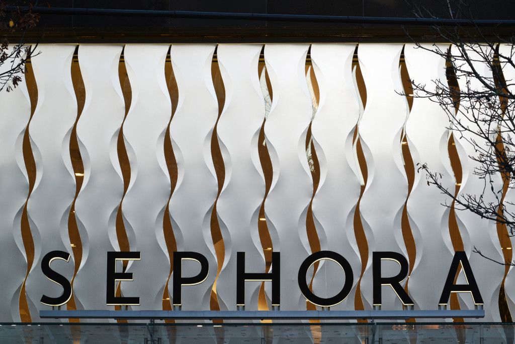
KPS created a series of four mockups for the decorative element, which appears to be a continuous sculpture but actually consists of 32 unique double-sided Sephora flame elements – each measuring approximately 10 feet high by 1.5 feet wide. The Sephora flame elements are ganged together in 10 groups of three and one group of two and are specially engineered so that they may be opened for storefront glass cleaning.
“We were able to achieve an accurate representation of the Sephora logo,” said Gatti. “The flame elements had to be aligned perfectly so that every negative space formed the ‘S’-shaped logo properly. The flame elements would have been easy to produce if we just had to cut the scallops and they remained flat, but they required special routing and manipulation to create the sculpted volumes. They almost look like air foils that are wide in the middle and tapered to the ends.”
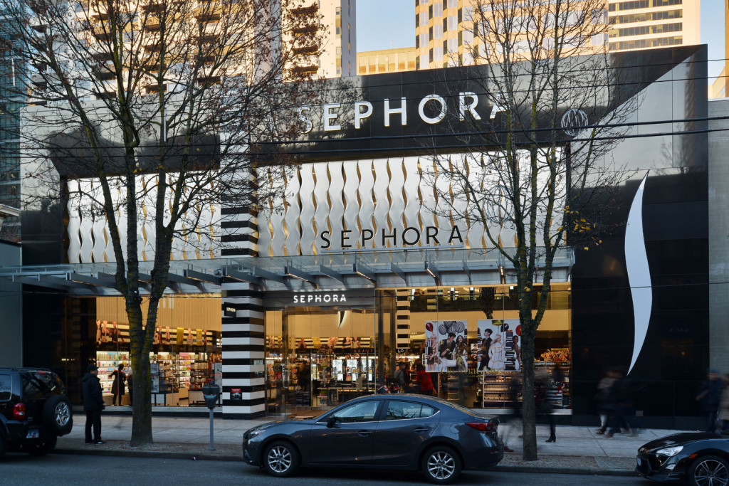
During a period of 1.5 years, KPS worked on design, engineering and mockup of the sculptural element and spent approximately 1.5 months on its fabrication and installation, which was completed in early October 2014.
“This project required very intensive labor in our shop, including a trial-and-error process to determine the best way to rout and manipulate the Alucobond to create volume,” said Gatti. “KPS likes being challenged. We knew that if we were going to be able to create this sculptural element that Alucobond was the only material that would work.”
“We were very happy with how this sculptural sunscreen turned out,” said Mitchell. “It’s been very well-received. It’s a great feature of the Sephora Robson Street store.”
Photography © Daniel Lunghi Photography
